Jump to content

Message Spacing


InsideEdge
  • Not Specified Not A Bug Bug
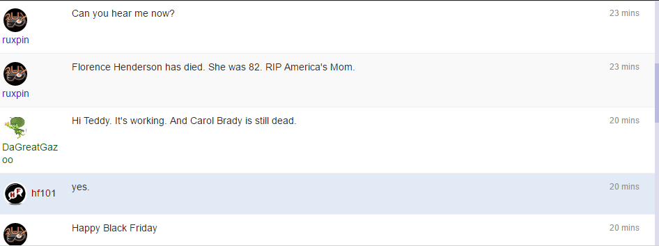
  • Is there a way to adjust the spacing for Messaging verticle heights.  Currently, they are quite wide and only 5 can be seen at a time.
  • The sender message area for longer names and avatars creates a wider and less attractive shout out and the display is all over the place -- to the right of the avatar, under the Avatar, double lined.
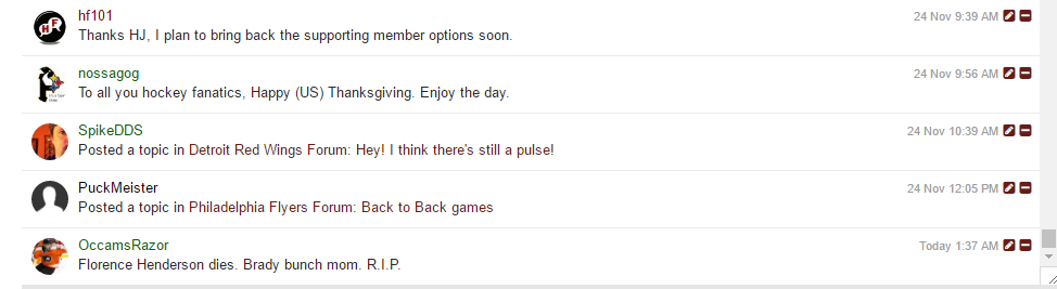
  • It is easier for me to explain with pictures thus compare with what the chatbox with extender does.

Current Babble widget:

Babble 1.png


chatbox and extender look like this.

chat.png


User Feedback

Recommended Comments

this isn't so much a bug as a styling choice.

the message row is 3 columns, the username is a fixed width, the message is dynamic width and the message time is is a fixed width.

you can in your custom.css, you can add:

.cBabbleRow .cBabbleUserMain { 
    width: 100px;
}

you can adjust the width rule till its corrected for long names and avatars.

Link to comment
Share on other sites

version 2 (what babble is currently on) was designed with the IPS chat in mind, i wasn't too sure what attracted people to it or to shoutbox (3.x), but they both had very similar designs, so why screw with a lineage? 

version 3 however draws inspiration from slack and skype, both i use a lot and have come to be my "gold" standard when it comes to expectation of what a new chat should have. so the message row is getting a complete revamp for version 3 :)

Link to comment
Share on other sites


×
×
  • Create New...